Sponsors


Charts and Graphs in Ionic 2 - Integrating Data Visualization with Different Libraries
It’s well know that in today’s world, the ability to store huge amounts of data in a coherent format, and to to perform data manipulation is of increasing importance. It’s not just the data of polls such as, population count, fertility rate, death rates, etc. that needs to be stored and manipulated from time to time, but real-time data such as, stock market rates, weather changes and other more complex issues. Perhaps most importantly data from social media networks needs to be considered in real-time.
Usually the data is stored in readable formats like CVS or JSON, and then read through a REST API provided by the data storage providers. Whatever technology you use to crawl the data, eventually you need to display the data in a readable format with graphs and chart that not only shows all the relevant information in concise format but also enables interactivity for users.
Ionic 2 provides AngularJS 2 support along with support for the TypeScript language, meaning any approach that is used in AngularJS 2 for data visualization can be used in Ionic 2 as well. There are several JavaScript libraries for data visualization through charts/graphs, including chart.js, chartist, c3.js, etc. and most of these libraries provide sophisticated documentation on their websites, but not a real-world application.
These libraries often support several graph formats, such as, line chart, bar chart, pie chart, doughnut chart, etc. meaning you can add whatever data you want, and it will show you the data in a sophisticated way. You can use Ionic 2 pages to show the data, which we will demonstrate later.
In this article, I am going to show you how you can do data visualization through charts and graphs using JavaScript libraries in Ionic 2. Let’s get started!
Graphs and Charts in Ionic 2 – Integrating Data Visualization with Different Libraries
As I mentioned earlier, data visualization is on the rise in its usage. Some people are visual learners, meaning they have trouble grasping the boring concrete details, so they feel excited when they see the interrelated connection of concepts in the data. Visual learners are intuitive people, so they are able to think in images better than they think in words.
We will be using some libraries here that work seamlessly with Ionic 2.
Let’s create a new project:
$ionic start ionic-charts blank –v2First, we are going to integrate chart.js that provides 8 different charts. It uses the <canvas> element of the HTML5 and the charts are highly responsive, meaning if you scale the browser, the charts will render again in the correct size, so they work for all the screen sizes. It’s also open-source, meaning you can add your own changes freely. You can read more about it on their site (http://www.chartjs.org/).
If you check out their docs page (http://www.chartjs.org/docs/), you will see a HUGE amount of information, but most of their examples are meant to be run in JavaScript, so we would need to translate the code to TypeScript.
Let’s first install the library:
$npm install chart.js --save
Now, let’s create a new page:
$ionic g page chart-js
Open the “chart-js.ts” and import the ‘Chart’ library:
import { Chart } from 'chart.js';
We will be using several methods from this library and use the <canvas> tag in our HTML for rendering the graphs. But first copy this code into your file:
chart-js.ts
import { Component, ViewChild } from '@angular/core';
import { NavController, NavParams } from 'ionic-angular';
import { Chart } from 'chart.js';
@Component({
selector: 'page-chart-js',
templateUrl: 'chart-js.html'
})
export class ChartJsPage {
// Our childs for different charts
// We would be using these for canvas elements
@ViewChild('barCanvas') barCanvas;
@ViewChild('doughnutCanvas') doughnutCanvas;
@ViewChild('lineCanvas') lineCanvas;
@ViewChild('radarCanvas') radarCanvas;
@ViewChild('polarCanvas') polarCanvas;
@ViewChild('pieCanvas') pieCanvas;
@ViewChild('bubbleCanvas') bubbleCanvas;
@ViewChild('mixedCanvas') mixedCanvas;
barChart: any;
doughnutChart: any;
lineChart: any;
radarChart: any;
polarAreaChart: any;
pieChart: any;
bubbleChart: any;
mixedChart: any;
constructor(public navCtrl: NavController) { }
ionViewDidLoad() {
console.log('ionViewDidLoad ChartJsPage');
this.barChart = this.getBarChart();
this.doughnutChart = this.getDoughnutChart();
this.lineChart = this.getLineChart();
this.radarChart = this.getRadarChart();
this.pieChart = this.getPieChart();
this.polarAreaChart = this.getPolarAreaChart();
this.bubbleChart = this.getBubbleChart();
this.mixedChart = this.getMixedChart();
}
getChart(context, chartType, data, options?) {
return new Chart(context, {
type: chartType,
data: data,
options: options
});
}
// This is our first chart
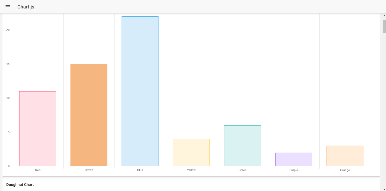
getBarChart() {
let data = {
labels: ["Red", "Brown", "Blue", "Yellow", "Green", "Purple", "Orange"],
datasets: [{
label: '# of Votes',
data: [11, 15, 22, 4, 6, 2, 3],
backgroundColor: [
'rgba(255, 99, 132, 0.2)',
'rgba(244, 164, 96, 0.8)',
'rgba(54, 162, 235, 0.2)',
'rgba(255, 206, 86, 0.2)',
'rgba(75, 192, 192, 0.2)',
'rgba(153, 102, 255, 0.2)',
'rgba(255, 159, 64, 0.2)'
],
borderColor: [
'rgba(255,99,132,1)',
'rgba(244, 164, 96, 1)',
'rgba(54, 162, 235, 1)',
'rgba(255, 206, 86, 1)',
'rgba(75, 192, 192, 1)',
'rgba(153, 102, 255, 1)',
'rgba(255, 159, 64, 1)'
],
borderWidth: 1
}]
};
let options = {
scales: {
yAxes: [{
ticks: {
beginAtZero: true
}
}]
}
}
return this.getChart(this.barCanvas.nativeElement, "bar", data, options);
}
getDoughnutChart() {
let data = {
labels: ["Red", "Brown", "Blue", "Yellow", "Green", "Purple", "Orange"],
datasets: [{
label: '# of Votes',
data: [12, 19, 3, 5, 2, 3],
backgroundColor: [
'rgba(255, 99, 132, 0.2)',
'rgba(244, 164, 96, 0.8)',
'rgba(54, 162, 235, 0.2)',
'rgba(255, 206, 86, 0.2)',
'rgba(75, 192, 192, 0.2)',
'rgba(153, 102, 255, 0.2)',
'rgba(255, 159, 64, 0.2)'
],
hoverBackgroundColor: ["#FF6384", "#551a8b", "#36A2EB", "#FFCE56", "#FF6384", "#36A2EB", "#FFCE56"]
}]
};
return this.getChart(this.doughnutCanvas.nativeElement, "doughnut", data);
}
getLineChart() {
var data = {
labels: ["January", "February", "March", "April", "May", "June", "July", "August"],
datasets: [
{
label: "Initial Dataset",
fill: false,
lineTension: 0.1,
backgroundColor: "rgba(75,192,192,0.4)",
borderColor: "rgba(75,192,192,1)",
borderCapStyle: 'butt',
borderDash: [],
borderDashOffset: 0.0,
borderJoinStyle: 'miter',
pointBorderColor: "rgba(75,192,192,1)",
pointBackgroundColor: "#fff",
pointBorderWidth: 1,
pointHoverRadius: 5,
pointHoverBackgroundColor: "rgba(75,192,192,1)",
pointHoverBorderColor: "rgba(220,220,220,1)",
pointHoverBorderWidth: 2,
pointRadius: 1,
pointHitRadius: 10,
data: [65, 59, 80, 81, 56, 55, 40, 32],
spanGaps: false,
},
{
label: "Final Dataset",
fill: false,
lineTension: 0.1,
backgroundColor: "rgba(175,92,192,0.4)",
borderColor: "rgba(31,156,156,1)",
borderCapStyle: 'butt',
borderDash: [5, 8],
borderDashOffset: 0.0,
borderJoinStyle: 'miter',
pointBorderColor: "rgba(31,156,156,1)",
pointBackgroundColor: "#fff",
pointBorderWidth: 1,
pointHoverRadius: 5,
pointHoverBackgroundColor: "rgba(31,156,156,1)",
pointHoverBorderColor: "rgba(220,220,220,1)",
pointHoverBorderWidth: 2,
pointRadius: 1,
pointHitRadius: 10,
data: [15, 39, 50, 81, 51, 55, 30, 70],
spanGaps: false,
}
]
};
return this.getChart(this.lineCanvas.nativeElement, "line", data);
}
getRadarChart() {
let data = {
labels: ["Eating", "Drinking", "Playing", "Designing", "Coding", "Dancing", "Running"],
datasets: [
{
label: "Initial Dataset",
backgroundColor: "rgba(179,181,198,0.2)",
borderColor: "rgba(179,181,198,1)",
pointBackgroundColor: "rgba(179,181,198,1)",
pointBorderColor: "#fff",
pointHoverBackgroundColor: "#fff",
pointHoverBorderColor: "rgba(179,181,198,1)",
data: [65, 59, 90, 81, 56, 55, 40]
},
{
label: "Final Dataset",
backgroundColor: "rgba(255,99,132,0.2)",
borderColor: "rgba(255,99,132,1)",
pointBackgroundColor: "rgba(255,99,132,1)",
pointBorderColor: "#fff",
pointHoverBackgroundColor: "#fff",
pointHoverBorderColor: "rgba(255,99,132,1)",
data: [28, 48, 40, 19, 96, 27, 100]
}
]
};
let options = {
scale: {
reverse: true,
ticks: {
beginAtZero: true
}
}
};
return this.getChart(this.radarCanvas.nativeElement, "radar", data, options);
}
getPolarAreaChart() {
let data = {
datasets: [{
data: [11, 16, 7, 3, 14],
backgroundColor: ["#FF6384", "#4BC0C0", "#FFCE56", "#E7E9ED", "#36A2EB"],
label: 'Current Dataset'
}],
labels: ["Red", "Green", "Yellow", "Grey", "Blue"]
};
let options = {
elements: {
arc: {
borderColor: "#000000"
}
}
};
return this.getChart(this.polarCanvas.nativeElement, "polarArea", data, options);
}
getPieChart() {
let data = {
labels: ["Red", "Blue", "Yellow"],
datasets: [
{
data: [300, 50, 100],
backgroundColor: ["#FF6384", "#36A2EB", "#FFCE56"],
hoverBackgroundColor: ["#FF6384", "#36A2EB", "#FFCE56"]
}]
};
return this.getChart(this.pieCanvas.nativeElement, "pie", data);
}
getBubbleChart() {
let data = {
datasets: [
{
label: 'Initial Dataset',
data: [
{ x: 20, y: 30, r: 15 },
{ x: 40, y: 10, r: 10 },
],
backgroundColor: "#FF6384",
hoverBackgroundColor: "#FF6384",
}]
};
let options = {
elements: {
points: {
borderWidth: 1,
borderColor: 'rgb(0, 0, 0)'
}
}
};
return this.getChart(this.bubbleCanvas.nativeElement, "bubble", data, options);
}
getMixedChart() {
let data = {
labels: ['Item 1', 'Item 2', 'Item 3'],
datasets: [
{
type: 'bar',
label: 'Bar Component',
data: [10, 20, 30],
backgroundColor: "#F5DEB3"
},
{
type: 'line',
label: 'Line Component',
data: [30, 20, 10],
backgroundColor: "#F5DEB3"
}
]
};
return this.getChart(this.mixedCanvas.nativeElement, "bar", data);
}
}You can see that first I have imported the required module. Then, I created several view Childs for referring our variables for rendering on the <canvas> element (we will see the HTML code later). Then I created a method getChart() that returns the Chart() method. This is required for every chart we are going to create, so we will be calling it in every method. The “option” is the optional parameter, this is why you will see the “question mark” at the end of method.
Then I created several methods for creating the supported charts. You can play with the values and see what the changes look like. We are passing the nativeElement of the canvas to our method for rendering the chart. Simple charts require only datasets, labels and color values. You can read the docs for more information.
Now, open the “chart-js.html” and copy the following code:
chart-js.html
<ion-header>
 <ion-navbar>
   <button ion-button menuToggle>
     <ion-icon name="menu"></ion-icon>
   </button>
   <ion-title>Chart.js</ion-title>
 </ion-navbar>
</ion-header>

<ion-content>
 <ion-card>
   <ion-card-header>
     Bar Chart
   </ion-card-header>
   <ion-card-content>
     <canvas #barCanvas></canvas>
   </ion-card-content>
 </ion-card>
 <ion-card>
   <ion-card-header>
     Doughnut Chart
   </ion-card-header>
   <ion-card-content>
     <canvas #doughnutCanvas></canvas>
   </ion-card-content>
 </ion-card>
 <ion-card>
   <ion-card-header>
     Line Chart
   </ion-card-header>
   <ion-card-content>
     <canvas #lineCanvas></canvas>
   </ion-card-content>
 </ion-card>
 <ion-card>
   <ion-card-header>
     Radar Chart
   </ion-card-header>
   <ion-card-content>
     <canvas #radarCanvas></canvas>
   </ion-card-content>
 </ion-card>
 <ion-card>
   <ion-card-header>
     Polar Area Chart
   </ion-card-header>
   <ion-card-content>
     <canvas #polarCanvas></canvas>
   </ion-card-content>
 </ion-card>
 <ion-card>
   <ion-card-header>
     Pie Chart
   </ion-card-header>
   <ion-card-content>
     <canvas #pieCanvas></canvas>
   </ion-card-content>
 </ion-card>
 <ion-card>
   <ion-card-header>
     Bubble Chart
   </ion-card-header>
   <ion-card-content>
     <canvas #bubbleCanvas></canvas>
   </ion-card-content>
 </ion-card>
 <ion-card>
   <ion-card-header>
     Mixed Chart
   </ion-card-header>
   <ion-card-content>
     <canvas #mixedCanvas></canvas>
   </ion-card-content>
 </ion-card>
</ion-content>
This code should be self-explanatory. Basically, we are using the <canvas> element for rendering our different charts. You can add as many charts you want.
Let’s add a bit of styling, open the “chart-js.scss” and copy the following code:
chart-js.scss
.ios, .md {

    page-chart-js {

        .scroll-content {
            background-color: map-get($colors, light);
        }

        ion-card-header {
            font-weight: bold;
        }

    }

}
This made sure that our scrolling is rendered correctly and that the font looks bold.
Make sure the page is added in “app.component.ts” and “app.module.ts”. You can do “ionic serve” to see the results.
The above approach was done with the native chart.js library albeit with typings. For the advanced stuff, like tables, real-time rendering, animation, etc. it may be difficult for you translate the JavaScript code to TypeScript. Thankfully, there is a library called “ng2-charts” that is actually designed as a directive for AngularJS 2, so you can use it in Ionic 2 apps as well.
Basically, it is based on the ChartJS 2.0 library that we used earlier.
So, let’s create a new page:
$ionic g page ng2-chartYou need to first install the library:
$npm install ng2-charts --save
We already installed the native Chart.js library earlier, so no need to install it again. Open the “app.module.ts” and import the “ChartsModule”, something like the following:
import { ChartsModule } from 'ng2-charts';

// In your App's module:
imports: [
  ChartsModule
]
We will be integrating the line chart example as seen in the official docs here (http://valor-software.com/ng2-charts/). Basically, we would generate the random data using the Math.random() function for our chart. Open “ng2-chart.ts” and copy the following code:
ng2-chart.ts
import { Component } from '@angular/core';
import { NavController, NavParams } from 'ionic-angular';
@Component({
selector: 'page-ng2-chart',
templateUrl: 'ng2-chart.html'
})
export class Ng2ChartPage {
constructor(public navCtrl: NavController, public navParams: NavParams) {}
ionViewDidLoad() {
console.log('ionViewDidLoad Ng2ChartPage');
}
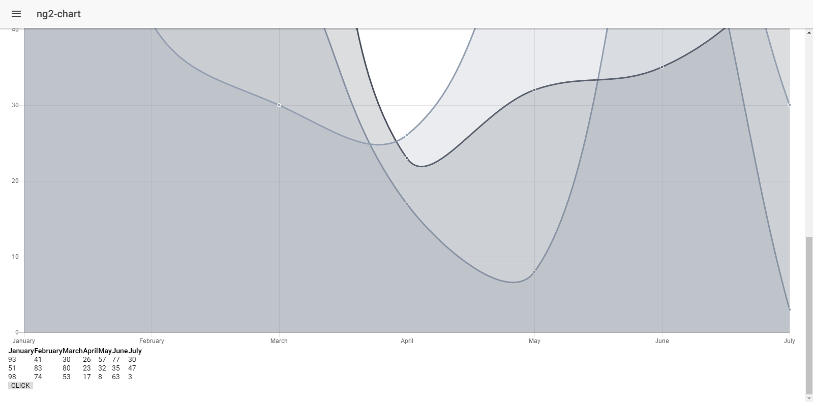
// lineChart
public lineChartData:Array<any> = [
{data: [65, 59, 80, 81, 56, 55, 40], label: 'Series A'},
{data: [28, 48, 40, 19, 86, 27, 90], label: 'Series B'},
{data: [18, 48, 77, 9, 100, 27, 40], label: 'Series C'}
];
public lineChartLabels:Array<any> = ['January', 'February', 'March', 'April', 'May', 'June', 'July'];
public lineChartOptions:any = {
responsive: true
};
public lineChartColors:Array<any> = [
{ // grey
backgroundColor: 'rgba(148,159,177,0.2)',
borderColor: 'rgba(148,159,177,1)',
pointBackgroundColor: 'rgba(148,159,177,1)',
pointBorderColor: '#fff',
pointHoverBackgroundColor: '#fff',
pointHoverBorderColor: 'rgba(148,159,177,0.8)'
},
{ // dark grey
backgroundColor: 'rgba(77,83,96,0.2)',
borderColor: 'rgba(77,83,96,1)',
pointBackgroundColor: 'rgba(77,83,96,1)',
pointBorderColor: '#fff',
pointHoverBackgroundColor: '#fff',
pointHoverBorderColor: 'rgba(77,83,96,1)'
},
{ // grey
backgroundColor: 'rgba(148,159,177,0.2)',
borderColor: 'rgba(148,159,177,1)',
pointBackgroundColor: 'rgba(148,159,177,1)',
pointBorderColor: '#fff',
pointHoverBackgroundColor: '#fff',
pointHoverBorderColor: 'rgba(148,159,177,0.8)'
}
];
public lineChartLegend:boolean = true;
public lineChartType:string = 'line';
public randomize():void {
let _lineChartData:Array<any> = new Array(this.lineChartData.length);
for (let i = 0; i < this.lineChartData.length; i++) {
_lineChartData[i] = {data: new Array(this.lineChartData[i].data.length), label: this.lineChartData[i].label};
for (let j = 0; j < this.lineChartData[i].data.length; j++) {
_lineChartData[i].data[j] = Math.floor((Math.random() * 100) + 1);
}
}
this.lineChartData = _lineChartData;
}
// events
public chartClicked(e:any):void {
console.log(e);
}
public chartHovered(e:any):void {
console.log(e);
}
}It should feel similar to the direct approach we used earlier especially when it comes to integrating the data and labels. What makes it different from the previous approach is that we’re no longer importing the Chart module here, as that is covered by the directive.
Now, open “ng2-chart.html” and copy the following code:
ng2-chart.html
<ion-header>
 <ion-navbar>
   <button ion-button menuToggle>
     <ion-icon name="menu"></ion-icon>
   </button>
   <ion-title>ng2-chart</ion-title>
 </ion-navbar>
</ion-header>

<ion-content padding>

<div class="row">
 <div class="col-md-6">
    <div style="display: block;">
    <canvas baseChart width="400" height="400"
                [datasets]="lineChartData"
                [labels]="lineChartLabels"
                [options]="lineChartOptions"
                [colors]="lineChartColors"
                [legend]="lineChartLegend"
                [chartType]="lineChartType"
                (chartHover)="chartHovered($event)"
                (chartClick)="chartClicked($event)"></canvas>
    </div>
 </div>
 <div class="col-md-6" style="margin-bottom: 10px">
    <table class="table table-responsive table-condensed">
     <tr>
        <th *ngFor="let label of lineChartLabels">{{label}}</th>
     </tr>
     <tr *ngFor="let d of lineChartData">
        <td *ngFor="let label of lineChartLabels; let j=index">{{d && d.data[j]}}</td>
     </tr>
    </table>
    <button (click)="randomize()">CLICK</button>
 </div>
</div>

</ion-content>
You can see that in the <canvas> element I am declaring “baseChart” along with all the options. That is the power of the directive! This way you can seamlessly integrate the charts as if you are working AngularJS 2/Ionic 2 library.
If you do “ionic serve”, you can see the beautiful chart with an ability to change the data randomly.
Using Chartist
Even though the Chart.js provides excellent simple charts, they are not very flexible and don’t let you customize much except some data values. Chartist provides highly customizable charts that are not only responsive, but also comes with several features, such as built-in animations, etc.
We are going to integrate Chartist.js through the help of “angular2-chartist” which, as the name suggests, is an Angular 2 components for Chartist.js.
Let’s create a new page:
$ionic g page chartist-demoNow you need to install the library:
$npm install @angular/core angular2-chartist chartist --saveAnd now install the typings:
$npm install @types/chartist --save-devOpen the “app.module.ts” and import the ChartistModule, like the in following:
import {
 ChartistModule
} from 'angular2-chartist';
…
…
@NgModule({
 imports: [
   ChartistModule,
 ],
….
The Github repository of the library (https://github.com/willsoto/angular2-chartist) provides a nice demo, so I realized it’s better to integrate this demo example in our code rather than creating the one from scratch as it shows the power of Chartist.
Go to “demo/components” and copy the three components “async-chart.component.ts”, “dynamic-chart.component.ts” and “live-chart.component.ts” in your “src/component” folder (if it isn’t created already), then create a new folder ‘component’. Also, copy the “data.json” to your “src/” directory (you can download the whole source code and then just copy/paste!)
Now, open these three components and replace every instance of '../../src/chartist.component' to 'angular2-chartist', because we have already installed this library.
Then, open the “chartist-demo.ts” and copy the following code:
chartist-demo.ts
import { Component } from '@angular/core';
import { NavController, NavParams } from 'ionic-angular';
import * as Chartist from 'chartist';

import {
 ChartType,
 ChartEvent
} from 'angular2-chartist';

declare var require: any;

const data: any = require('../../data.json');

export interface Chart {
 type: ChartType;
 data: Chartist.IChartistData;
 options?: any;
 responsiveOptions?: any;
 events?: ChartEvent;
}

@Component({
 selector: 'page-chartist-demo',
 templateUrl: 'chartist-demo.html'
})
export class ChartistDemoPage {

 ionViewDidLoad() {
   console.log('ionViewDidLoad ChartistDemoPage');
 }

 charts: Chart[];

 constructor(public navCtrl: NavController, public navParams: NavParams) {
   this.charts = [{
     type: 'Bar',
     data: data['Bar']
   }, {
     type: 'Line',
     data: data['Line']
   }, {
     type: 'Line',
     data: data['Line2']
   }, {
     type: 'Line',
     data: data['Scatter'],
     options: {
       showLine: false,
       axisX: {
         labelInterpolationFnc: function(value: number, index: number): string {
           return index % 13 === 0 ? `W${value}` : null;
         }
       }
     },
     responsiveOptions: [
       ['screen and (min-width: 640px)', {
         axisX: {
           labelInterpolationFnc: function(value: number, index: number): string {
             return index % 4 === 0 ? `W${value}` : null;
           }
         }
       }]
     ]
   }, {
     type: 'Line',
     data: data['LineWithArea'],
     options: {
       low: 0,
       showArea: true
     }
   }, {
     type: 'Bar',
     data: data['Bi-PolarBar'],
     options: {
       high: 10,
       low: -10,
       axisX: {
         labelInterpolationFnc: function(value: number, index: number): number {
           return index % 2 === 0 ? value : null;
         }
       }
     }
   }, {
     type: 'Bar',
     data: data['DistributedSeries'],
     options: {
       distributeSeries: true
     }
   }, {
     type: 'Pie',
     data: data['Pie'],
     options: {
       donut: true,
       donutWidth: 60,
       startAngle: 270,
       total: 200,
       showLabel: false
     }
   }, {
     type: 'Pie',
     data: data['Pie'],
     options: {
       donut: true,
       showLabel: false
     }
     // events: {
     //   draw(data: any): boolean {
     //     return data;
     //   }
     // }
   }];
 }
}
This code shouldn’t be too hard to understand. Basically we are adding different charts along with their values.
Now, open the “chartist-demo.html” and copy the following code:
chartist-demo.html
<ion-header>
 <ion-navbar>
   <button ion-button menuToggle>
     <ion-icon name="menu"></ion-icon>
   </button>
   <ion-title>Chartist Demo</ion-title>
 </ion-navbar>
</ion-header>

<ion-content padding>

<div *ngFor="let chart of charts">
 <x-chartist
   class="col-md-6"
   [data]="chart.data"
   [type]="chart.type"
   [options]="chart.options"
   [responsiveOptions]="chart.responsiveOptions"
   [events]="chart.events">
 </x-chartist>
</div>

<div class="row">
 <div class="col-md-6">
   <async-chart></async-chart>
 </div>
 <div class="col-md-6">
   <live-chart></live-chart>
 </div>
</div>

<div class="row">
 <div class="col-md-6">
   <dynamic-chart></dynamic-chart>
 </div>
 <div class="col-md-6">
 </div>
</div>

</ion-content>
Oh, we need to modify our SCSS a bit, so open the “chartist-demo.scss” and copy the following code:
chartist-demo.scss
page-chartist-demo {

    x-chartist {
     display: block;
     height: 300px;
   }
}
Make sure this page is included in “app.component.ts” and “app.module.ts” (along with the three components we are using).
You can do “ionic serve” now to see the results.
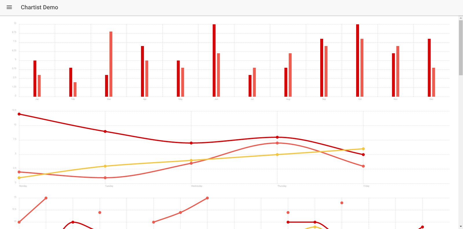
You can see the same demo example here (https://willsoto.github.io/angular2-chartist/demo/). The last three charts are rendering through the help of those three components. Basically, they are updating in real-time and really demonstrate the power of Chartist. You can play with the values and see the changes to figure out how it is working.
…and there’s more
Okay, so I highlighted these two major libraries for rendering charts and graphs. I used these libraries because they are very mature, especially when it comes to integration in AngularJS 2/Ionic 2. But, there are even more JavaScript libraries that can be integrated in Ionic 2 with some efforts. There is a cool resource about it here (https://www.angularjs4u.com/angularjs2/top-20-angular-2-charts-graphs/).
In the next article, we will see how we can use these charts for rendering stock quotes.
Conclusion
Thus so far, you can see that it’s actually quite easy to integrate the charts and graphs in Ionic 2 applications through different libraries. You can customize these charts as much as you want, and even add your own data that is based on real-world scenarios!
Check out my previous article on forms and validation with Firebase or
Visit the homepage to search and compare JavaScript libraries.
Recent Stories


Top DiscoverSDK Experts


Featured Products

Compare Products
Select up to three two products to compare by clicking on the compare icon () of each product.
{{compareToolModel.Error}}
{{CommentsModel.TotalCount}} Comments
Your Comment