Sponsors


Custom Themes in Ionic 2 – Integrating Different Themes in Application
One of the coolest aspects of developing mobile applications with hybrid frameworks instead of native development is that the same User Interface (UI) is deployed over all supported platforms. This means the icons, buttons and other user interactions looks similar in all the platforms, so the user feels at home if they are running the application in multiple devices.
However, this could be a drawback if the user has different taste regarding the UI or prefers to operate with native UI on different platforms. So does this mean you need to code the UI differently for all the platforms? Well, actually no. Ionic 2 provides the theming functionality which allows you to create customized themes for user interaction stuff, including buttons, background, icons, alerts, and many more with some changes in SASS (Syntactically Awesome Style Sheets) sheets.
Having said that, you can create several themes, and then either allow the user to change the theme through the options/settings in your application, or set the specific theme per platform when performing the platform check. With it, you can imitate the native UI look of the platforms with different themes and configurations.
The User Experience (UX) is affected greatly with the use of themes, for this reason exactly a native UI look is preferred in general when developing apps for supported platforms, especially when the custom UI are not stable in their looks and the technology is still in the Beta stage. But, technically speaking, Ionic 2 only imitates the native UI appearance in default themes and UI components are not actually native.
In this article, I am going to show you how you can create custom themes and how to use them properly in Ionic 2. Let’s get started!
Custom Themes in Ionic 2 – Integrating Different Themes into your Application
Like I said earlier, you can either allow the users to select different themes or set the themes per platform. We will look at both the approaches. But, first let’s understand how theming is done in Ionic 2.
When you create a new page, then you get the component file (home.ts), its HTML view file (home.html) and its styling file (home.scss). Notice that Ionic 2 doesn’t use CSS for styling, rather it uses SCSS (Sassy CSS), which is kind of an extension to CSS, meaning some new features are added, such as, variables, nesting, mixins, etc.
Basically, SCSS allows you to do the styling more easily compared to CSS, because the syntax supports more features, and so reduces the complexity in language. When building the application, SCSS files eventually compiles to CSS, because browsers only understand the CSS (just like how TypeScript is compiled to ES5/JavaScript).
When working with Ionic 2, you only edit the .html and .scss and never the .css files directly, because even if you make the changes to the .css files directly, they will be overwritten by the .sass files. You don’t need to install SCSS separately, as Ionic 2 already supports it.
There is another syntax, called “SASS” which is similar to SCSS, except there is a difference in syntax, so for example SASS uses the whitespace and indentation to specify blocks similar to Python. Ionic 2 uses SCSS by default for both the components and themes because of cleaner and concise syntax, while still remaining true to the flavor of CSS.
SASS is actually not an extension to the CSS language, but is rather only a preprocessor. On the other hand, SCSS is an extension to CSS, so any valid CSS code is a valid in SCSS (you can rename .css files to .scss and they will work!) You can read more here (stackoverflow.com/questions/5654447/whats-the-difference-between-scss-and-sass).
Even though Ionic 2 documentation cover the basic usage of themes (https://ionicframework.com/docs/v2/theming/), it doesn’t go into depth on how you can create your own theme, so we will look at the process.
Creating a project
Enough talk, let’s create a new project:
$ionic new ionic-theme blank –v2We can either define the variables globally or make changes in the page specific SCSS files. We can modify the variables in “theme/variable.scss” which will apply the settings globally, these are default values that can be modified. The “app/app.scss” is used for importing the different themes, and the changes in this file is applied to all the components and not just app component, these settings override the “variable.scss”, so for example, if we have defined “$instagram-button-size: 100px;” in “variable.scss”, but defined “$instagram-button-size: 350px;” in “app.scss”, then the second configuration will be applied.
You can create variables in SCSS, something like following:
$facebook-width: 40px;Basically, it uses the $ sign for declaring variables. You can define as many variables as you want, and so whenever you need it, just put it, something like following:
page-home {
 .facebook-button {
    width: $facebook-width;
 }
}
The advantage of this is that you can apply the variables to as many elements you want, and if you change the value of a variable, then it applies to every element that uses the variable!
If you notice the above code, “.facebook-button” is nested in “page-home”. This was not possible in plain CSS. It’s called nesting. You can nest as many elements you want.
You can also use mixins, inheritance and many more features that you can read about here (http://sass-lang.com/guide).
Okay… so let’s do some theming! Open “theme/variables.scss” and change the “$colors” map to following:
$colors: (
 primary:    #387ef5,
 secondary:  #32db64,
 danger:     #f53d3d,
 light:      #f4f4f4,
 dark:       #222,
 twitter:    #55acee,
 facebook:     #3b5998,
 tumblr:     #35465c,
 instagram:  #3f729b
);
The “$colors” array is used for changing the color values globally. By default Ionic components uses primary, secondary, danger, etc., so if you change the values to something else, then all those elements/components will be changed in their color! In most cases, changing the “primary” gives the quick results. You can add as many custom variables as you want for the colors.
Now, add the following line:
$instagram-button-size: 100px;We will be adding both of these very soon. Now, open “app/app.scss” and add the following anywhere in the file:
$instagram-button-size: 350px;I have changed its value to demonstrate that “app.scss” overrides the variables in “variables.scss”, and it is applied to all the components.
Now, open “home/home.scss” and copy the following content:
home.scss
page-home {
 .instagram-button {
    width: $instagram-button-size;
 }
}
Here, I have finally applied the value to the element. Now, open the “home.html” and copy the following content (I am pasting all the content):
home.html
<ion-header>
<ion-navbar>
<button ion-button menuToggle>
<ion-icon name="menu"></ion-icon>
</button>
<ion-title>Home</ion-title>
</ion-navbar>
</ion-header>
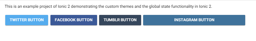
<ion-content padding>
<div>This is an example project of Ionic 2 demonstrating the custom themes and the global state functionality in Ionic 2.
</div>
 <br>
 <button ion-button color="twitter">Twitter Button</button>
 <button ion-button color="facebook">Facebook Button</button>
 <button ion-button color="tumblr">Tumblr Button</button>
 <button class="instagram-button" ion-button color="instagram">Instagram Button</button>
</ion-content>
You can do “ionic serve” to see the different buttons!
Apart from it, you can use several utility attributes like text-left, text-right, padding, ion-buttons, etc. See here (https://ionicframework.com/docs/v2/theming/css-utilities/) for more information.
We will be creating three themes: light, dark and intense.
But, first we will create a global state that will store the global variables because we need to change the themes dynamically. In “src/app” create a new file “app.global.ts” and copy the following content:
app.global.ts
import { Injectable } from '@angular/core';
@Injectable()
export class AppState {
   _state = {}
   constructor() {
   }

   get state() {
       return this._state = this._clone(this._state);
   }

   set state(value) {
       throw new Error('do not mutate the `.state` directly');
   }
   get(prop?: any) {
       const state = this.state;
       return state.hasOwnProperty(prop) ? state[prop] : state;
   }
   set(prop: string, value: any) {
       return this._state[prop] = value;
   }
   _clone(object) {
       return JSON.parse(JSON.stringify(object));
   }
}
This class is for storing the global variables. If you have come from C++/Java background, then you know that in those languages we define a global class for global settings/configurations, so we are using the same approach here, thanks to the power of TypeScript!
Add this file in the “providers” array of “app.module.ts”.
Now, let’s create a new page for changing themes:
$ionic g page theming
Open the “theming.ts” and copy the following content:
theming.ts
import { Component } from '@angular/core';
import { NavController, NavParams } from 'ionic-angular';

import { AppState } from '../../app/app.global';

@Component({
 selector: 'page-theming',
 templateUrl: 'theming.html'
})
export class ThemingPage {

 ionViewDidLoad() {
   console.log('ionViewDidLoad ThemingPage');
 }

 constructor(public navCtrl: NavController, public navParams: NavParams, public global: AppState) {
 }

 changeTheme(theme) {
   this.global.set('theme', theme);
 }
}
Here, we are using the changeTheme() method to change our global state. This change in state will reflect the file globally. We will later apply the theme to our entire pages.
Before editing the “theming.html”, let’s first add the themes. In “src/theme/” folder, create a new file “light.theme.scss” and copy the following content:
light.theme.scss
.theme-light {
 transition: all 1.1s ease;
 background-color: #fff;
 // background: #0c1a2c;
 // background: linear-gradient(to bottom,rgba(9,16,25,1) 0,rgba(30,28,58,1) 25%,rgba(30,28,58,1) 75%,rgba(11,12,22,1) 100%);
 h1,
 h2,
 h3,
 h4,
 h5,
 h6,
 p,
 .toolbar-title,
 .bar-button-default,
 body,
 div {
   transition: all 1.1s ease;
   color: white;
 }
 .onboard {
   border-color: #212121 !important;
 }
 .toolbar-background,
 .toggle-checked {
   transition: all 1.1s ease;
   background-color: #212121 !important;
 }
 .item-note,
 .themeButton,
 .swiper-pagination-bullet {
   transition: all 1.1s ease;
   //background-color: #fff;
   //border-style: solid;
   //border-width: 1px;
   //border-color: white;
 }
 ion-content,
 .input-wrapper,
 .item-inner,
 .item,
 ion-footer,
 ion-item,
 ion-label {
   transition: all 1.1s ease;
   background-color: #303030 !important;
   background: #303030 !important;
   color: black !important;
 }
 ion-list {
   background-color: #100815;
 }
 .time {
   background-color: white;
 }
 .item {
   transition: all 1s ease;
   background-color: white;
   color: black;
 }
 .range-bar {
   background-color: #463E3F !important;
 }
 .s2,
 .s3,
 .toggle-inner,
 .range-pin,
 .range-pin::before,
 .range-knob,
 .range-bar-active {
   background-color: white !important;
   color: black !important;
 }
}
If you visit the themes directory (https://github.com/driftyco/ionic/tree/master/src/themes) of Ionic, then will find the “default” theme (ionic.theme.default.scss), which is actually the light theme. You can copy the code in it and then paste it in “variables.scss” to see the results. But doing this only changes the themes statically. For this reason, I converted the light theme into its separate file.
As a matter of fact, you can copy and paste the contents in “ionic.theme.dark.scss” to “variables.scss” to get the dark theme or you can create a new file “dark.scss” and paste the contents there and then change the ending of “$colors” map “);” to “) !default;” (after importing the theme in “app.scss”), but let’s create a dark theme in our own way.
In the same directory, create a new file “dark.theme.scss” and copy the following content:
dark.theme.scss
.theme-dark {
 transition: all 1.1s ease;
 background-color: #303030;
 // background: #0c1a2c;
 // background: linear-gradient(to bottom,rgba(9,16,25,1) 0,rgba(30,28,58,1) 25%,rgba(30,28,58,1) 75%,rgba(11,12,22,1) 100%);
 h1,
 h2,
 h3,
 h4,
 h5,
 h6,
 p,
 .toolbar-title,
 .bar-button-default,
 body,
 div {
   transition: all 1.1s ease;
   color: white;
 }
 .onboard {
   border-color: #212121 !important;
 }
 .toolbar-background,
 .toggle-checked {
   transition: all 1.1s ease;
   background-color: #212121 !important;
 }
 .item-note,
 .themeButton,
 .swiper-pagination-bullet {
   transition: all 1.1s ease;
   //background-color: #fff;
   //border-style: solid;
   //border-width: 1px;
   //border-color: white;
 }
 ion-content,
 .input-wrapper,
 .item-inner,
 .item,
 ion-footer,
 ion-item,
 ion-label {
   transition: all 1.1s ease;
   background-color: #303030 !important;
   background: #303030 !important;
   color: white !important;
 }
 ion-list {
   background-color: #100815;
 }
 .time {
   background-color: white;
 }
 .item {
   transition: all 1s ease;
   background-color: #100815;
   color: white;
 }
 .range-bar {
   background-color: #463E3F !important;
 }
 .s2,
 .s3,
 .toggle-inner,
 .range-pin,
 .range-pin::before,
 .range-knob,
 .range-bar-active {
   background-color: white !important;
   color: black !important;
 }
}
The difference in this theme and the previous theme is some changes in the color hex code and the replacement of “white” with “black” and not much else really.
In your “app.scss”, import the themes:
@import '../theme/dark.theme';

@import '../theme/light.theme';
Now, open the “theming.html” and copy the following content:
theming.html
<ion-header>
<ion-navbar>
<button ion-button menuToggle>
<ion-icon name="menu"></ion-icon>
</button>
<ion-title>Theming</ion-title>
</ion-navbar>
</ion-header>
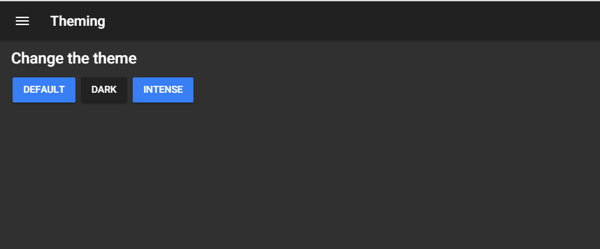
<ion-content padding>
<h3>Change the theme</h3>
<button ion-button (click)="changeTheme('')">Default</button>
<button ion-button color="dark" (click)="changeTheme('theme-dark')">Dark</button>
</ion-content>We have created two buttons here. The second button has the “dark” color.
Make sure this page is included in “app.component.ts” and “app.module.ts”. Also, if you have created this project with a blank template, then make sure that pages are set in “app.html” (refer to previous applications for code).
If you do “ionic serve” now, then the buttons would do nothing, but why? Because we haven’t defined a code to change the theme. In your “app.html”, we need to add a <div> element to all the elements/stuff, and the class will be set as “global.state[‘theme’]”. Open the file and copy the following code:
app.html
<div class="{{global.state['theme']}}">
<ion-menu type="push" [content]="content">
 <ion-header>
   <ion-toolbar>

     <ion-title>Menu</ion-title>
   </ion-toolbar>
 </ion-header>

 <ion-content>
   <ion-list>

     <button menuClose ion-item *ngFor="let p of pages" (click)="openPage(p)">
       {{p.title}}
     </button>
   </ion-list>
 </ion-content>

</ion-menu>

<!-- Disable swipe-to-go-back because it's poor UX to combine STGB with side menus -->
<ion-nav [root]="rootPage" #content swipeBackEnabled="false">

</ion-nav>
</div>
This will apply the theme to all the elements and components whenever there is a change in state, which we are triggering through toggle buttons in our “theming” page. Make sense?
Do “ionic serve” to see the awesome effect!
With this method, we can create as many themes as we want. All we need to do is just create a new theme file in the “src/theme” folder and import the theme in “app.scss”.
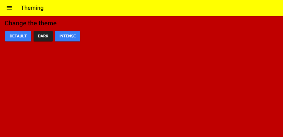
Let’s create another theme “intense.theme.scss”. Copy the following content:
intense.theme.scss
.theme-intense {
 transition: all 1.1s ease;
 background-color: #c00000;
 // background: #0c1a2c;
 // background: linear-gradient(to bottom,rgba(9,16,25,1) 0,rgba(30,28,58,1) 25%,rgba(30,28,58,1) 75%,rgba(11,12,22,1) 100%);
 h1,
 h2,
 h3,
 h4,
 h5,
 h6,
 p,
 .toolbar-title,
 .bar-button-default,
 body,
 div {
   transition: all 1.1s ease;
   color: black;
 }
 .onboard {
   border-color: #ffff00  !important;
 }
 .toolbar-background,
 .toggle-checked {
   transition: all 1.1s ease;
   background-color: #ffff00  !important;
 }
 .item-note,
 .themeButton,
 .swiper-pagination-bullet {
   transition: all 1.1s ease;
   //background-color: #fff;
   //border-style: solid;
   //border-width: 1px;
   //border-color: white;
 }
 ion-content,
 .input-wrapper,
 .item-inner,
 .item,
 ion-footer,
 ion-item,
 ion-label {
   transition: all 1.1s ease;
   background-color: #c00000 !important;
   background: #c00000 !important;
   color: black !important;
 }
 ion-list {
   background-color: #100815;
 }
 .time {
   background-color: black;
 }
 .item {
   transition: all 1s ease;
   background-color: 100815;
   color: black;
 }
 .range-bar {
   background-color: #463E3F !important;
 }
 .s2,
 .s3,
 .toggle-inner,
 .range-pin,
 .range-pin::before,
 .range-knob,
 .range-bar-active {
   background-color: black !important;
   color: black !important;
 }
}
Import the theme in “app.scss”:
@import '../theme/intense.theme';Include the button for it in “theming.html”:
<button ion-button (click)="changeTheme('theme-intense')">Intense</button>And now do “ionic serve” to see the cool result!
Apart from creating your own themes, you can either buy themes from the store (https://market.ionic.io/themes) which includes free themes as well. You can get ideas for themes as well from such sites.
You can also override the individual default variables. See here (https://ionicframework.com/docs/v2/theming/overriding-ionic-variables/) for more information.
I have uploaded the code to Github repository (https://github.com/danyalzia/ionic2-themes-play) in case you have trouble reading the code.
Platform specific theming
You can do platform specific theming using modes like md (Material Design) for Android, ios for iOS, wp for Windows, etc. Just add the mode to the element, something like the following:
.md button {
 text-transform: capitalize;
}
And so, the class will be added to <ion-app> automatically when running on Android:
<ion-app class="md">
You can even apply the settings in specific files, i.e., “app.md.scss”, but this method is deprecated in favor of modes.
ios and md classes are used to specify the platform specific code. Like I mentioned in the first place, one of the easiest ways to manipulate the theme is to change the attributes (primary, secondary, danger, light, dark).
Generating Icons and Splash Screens
At the moment, I like to point out that we have been using the default icon and splash screen for every app we create so far, but it’s a bit boring to see the same image every time. Thankfully, Ionic 2 provides automatic generation of icons and splash screens with your custom assets.
If you open the “resources” folder, then you will see two images, “icon.png” and “splash.png”. These two files are used for generating the icons/splash screens for every supported size. The folder “android” and “ios” contains those files that will be generated by the CLI. You need to replace these files with your custom files. You can even use Photoshop (.psd) and Illustrator (.ai) files.
Then do “ionic resources –icon” for generating icons and “ionic resources –splash” for generating splash screens. You can do “ionic resources” to generate both at the same time.
Creating custom icons
You can also add your own custom icons for the buttons and other user interfaces through SCSS. All you need to do is translate your SVG icon file to the font icon format through this (https://icomoon.io) site and replace it with the classes of ionic. I won’t be covering the details here as these are very simple instructions. Read here (http://stackoverflow.com/questions/38462885/add-custom-icon-in-ionic-2) for more details.
Conclusion
Thus so far you can see that it’s not really scary to create custom themes in Ionic 2. It’s like setting and changing some text and copying/pasting the code from here and there. So if you have a passion for theming and styling, you will excel in the designing phase of application development.
If you have any question, then please ask in the comment section below and be sure to use the homepage to discover thousands of development tools.
Recent Stories


Top DiscoverSDK Experts


Featured Products

)
)
)
Compare Products
Select up to three two products to compare by clicking on the compare icon () of each product.
{{compareToolModel.Error}}
{{CommentsModel.TotalCount}} Comments
Your Comment