Sponsors


Converting a fixed website to a responsive design: overview and brief guide
More than 50% of webpages visited each day are viewed on mobile devices. The fact that these devices are becoming increasingly sophisticated, coupled with their ever decreasing prices, makes surfing the web on them more and more convenient. This is leading to the personal computer becoming superfluous in many households. Along with this, external hardware devices such as Bluetooth keyboards have made the tablet a fully functional office device. Indeed, website owners can expect to see the percentage of mobile traffic to their sites increase each year.
This makes it imperative for website designers and developers to ensure their sites look good on all devices. One method of tackling this task is to create multiple versions of the site for the various devices in use. This however can turn into a massive undertaking considering the range and variety of screen sizes, proportions, and resolutions so that this option is fast becoming irrelevant.
The better and increasingly popular option for dealing with mobile devices is to build responsive sites. But what exactly is a responsive website?
Responsive sites are those that change their design and layout to fit the size of the screen they are being viewed on; they "respond" to the screen size and change the display accordingly. A good responsive site is one that uses the same code for all sizes, and changes its layout with CSS only without relying on JavaScript. It is preferable to plan out all the layouts ahead of time as this will speed up development and help prevent the use of too much JavaScript.
So how does one go about creating a responsive site? There are three major components that must be considered: HTML, CSS, and JavaScript.
HTML
The site's HTML should be written in a way such that the desktop, tablet, and mobile layouts are all taken into consideration. The site should be built so that the HTML elements can be easily changed and adapted. As such, in order to convert an existing site to be responsive it would be worthwhile to invest time from the outset and change the HTML structure accordingly. In short, clean up the HTLM so that it is well organized. Here is an example of well-structured HTML that can be used across multiple devices and screen sizes along with the CSS for desktop and mobile:
<div class="container">
    <div class="item">Item 1</div>
    <div class="item">Item 2</div>
    <div class="item">Item 3</div>
</div>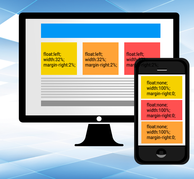
Notice how the HTML doesn't change. Using only CSS we are able to adapt the elements to suit the screen size.
CSS
Once you've got your HTLM in line, you can start to write the CSS which will turn the site responsive. The bulk of the work in turning a site responsive will be done in the CSS. This is done by using what are known as media queries and the @media rule. Have a look at the following:
@media screen and (max-width:680px)
{
    .item
    {
    float:none;
    width:100%;
    margin-right:0;
    }
}
This means that so long as the screen is smaller than 680 pixels, any element with the class .item will receive the styles inside the block. This method of using media queries to override and change the CSS of the site's HTML elements would be used throughout the webpage.
One thing to consider is how users interact with the site on various devices, for instance the use of a mouse on a desktop versus swiping on a smartphone. Many site elements are likely built so that they respond to the mouse cursor hovering over them. However, this won't work for phones and tablets leaving hover irrelevant for mobile devices.
For example, imagine an element on a webpage that when you hover over it, additional content is displayed. This feature would have to be changed on the mobile layouts—perhaps to a button that displays and hides the content with a screen press.
JavaScript
Here, one must check that all areas of the code are supported by all major mobile browsers—check all the various plugins you may be using along with galleries etc. Depending on the size and scope of your site, it may be worthwhile to make use of JavaScript libraries that support mobile development and feature "touch events." Use of such libraries can greatly ease much of the development process when converting a site to a responsive design. One example of such a library would be jQuery Mobile, but there are countless others.
Hope you've enjoyed this brief introduction into responsive site development. There are myriad sources on the web with all the info you need to help convert your page to be fully responsive. You'll have to cover several topics like viewport, scalability, zoom, and more. So if your site isn't 100% mobile friendly and responsive, well then you'd best get to work!
Recent Stories


Top DiscoverSDK Experts


Featured Products

)
)
)
Compare Products
Select up to three two products to compare by clicking on the compare icon () of each product.
{{compareToolModel.Error}}
{{CommentsModel.TotalCount}} Comments
Your Comment