Sponsors


Bootstrap Review
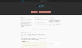
Bootstrap is a front-end framework commonly used for creating responsive websites. Its main purpose is to make mobile friendly front-end development faster and easier. It is a free and very established front-end web framework—a technology that is becoming increasingly popular among web developers today.
As a web developer, you can't just settle for doing back-end programming tasks. You have to be flexible to survive in this kind of industry and the front-end development an application is never easy. You have to deal with CSS, JS, HTML etc., and since we are now living in a mobile era, it's become essential to make sure your app is completely mobile friendly. This is especially true now that most transactions and processes are done on mobile devices. In the past, development for the Mobile and Desktop view of an application was done separately due to their different screen sizes. This is where Bootstrap comes into play, easing the development of your application on both mobile and desktop views at once. It makes an application that automatically and dynamically adjusts to the screen size in what is known as responsive design.
Below are my views on why Bootstrap is simply one of the best:
Easy and More options to Set it up
Install using Bower
$ bower install bootstrap
Install using npm
$ npm install bootstrap
Install with composer
$ composer require twbs/bootstrap
You also have the option to use its CDN whenever you don’t feel like downloading it.
<!-- Latest compiled and minified CSS -->

 <link rel="stylesheet" href="https://maxcdn.bootstrapcdn.com/bootstrap/3.3.6/css/bootstrap.min.css" integrity="sha384-1q8mTJOASx8j1Au+a5WDVnPi2lkFfwwEAa8hDDdjZlpLegxhjVME1fgjWPGmkzs7" crossorigin="anonymous">

<!-- Optional theme -->

 <link rel="stylesheet" href="https://maxcdn.bootstrapcdn.com/bootstrap/3.3.6/css/bootstrap-theme.min.css" integrity="sha384-fLW2N01lMqjakBkx3l/M9EahuwpSfeNvV63J5ezn3uZzapT0u7EYsXMjQV+0En5r" crossorigin="anonymous">

 <!-- Latest compiled and minified JavaScript -->

 <script src="https://maxcdn.bootstrapcdn.com/bootstrap/3.3.6/js/bootstrap.min.js" integrity="sha384-0mSbJDEHialfmuBBQP6A4Qrprq5OVfW37PRR3j5ELqxss1yVqOtnepnHVP9aJ7xS" crossorigin="anonymous"></script>
Just include it in your page and you can now use Bootstrap.
Support - You will not have a hard time finding quality documentation should you become stuck on something while developing an application using Bootstrap. Their documentation is continuously updated by its creators so that you'll never be late with new technology trends. Even if you’re just started to learn, the documentation will give you a great guide without any hassles.
Faster Development - This is the most advantageous aspect of bootstrap. Bootstrap is cross-browser compatible but also compatible with the popular CSS preprocessor "less", which can add functionality and help utilize your time and effort. I personally recommended this technology to friends and colleges who are also web developers. Bootstrap also has ready-made themes that can be purchased or found for free. These can be modified at any time to suit the aesthetics of your app. Most of the applications I've made are from http://startbootstrap.com/ templates. I just change the CSS, images and some backend functionalities and boom! Just like that I find I've finished a smaller project within a week.
Easy to Use - You can always refer to its detailed documentation. Just download and install using console (if you're using Mac or Linux) from their website and you can start building you app immediately. You don’t have to spend a lot of time dealing with CSS to make you page responsive. By using its pre-defined classes, you’ll be done in no time.
Example
<table class =”table”>
   <tr>
     <td></td>
  </tr>
</table>
- Class = “table” is one of hundreds of classes that Bootstrap offers. Using this class, your table will automatically adjust itself based on the size of your screen making it look good.
Grid System – This is one of the main components of Bootstrap—it is the technology used to make pages responsive using predefined classes in a Grid System layout. It will simply rearrange columns of the grid depending on the size of screen.
Example
<div class="row">
   <div class="col-md-4"></div>
   <div class="col-md-4"></div>
   <div class="col-md-4"></div>
</div>
- In the example above, you’ll get three equal-width columnsstarting at desktops and scaling to large desktops
Flexible - CSS framework with predefined classes for layout using its grid system, various CSS components and JavaScript functions are included so it gives the developers the freedom to use different classes that are needed for markup.
Lots of Components – Bootstrap offers a lot of useful components for your website. This includes Glyphicons, Navbars, Labels, Headers, Media objects, Panels, Button groups and dropdowns, input groups and many more. This helps us web developers to save our time from making custom CSS and JS from scratch. We just choose the right classes for the required components to take effect.
Example:
<div class="input-group">
   <span class="input-group-addon" id="basic-addon1">Username</span>
   <input type="text" class="form-control" placeholder="Username" aria-describedby="basic-addon1">
</div>
In the example above, class=”input-group” will create a responsive input type and with the class="input-group-addon". It will create additional design on your input type making it more understandable on what data this field should have.
Lots of JavaScript Libraries – Bootstrap also has a lot of pre-developed JavaScript plugins. These include Modal, Popover, Alert, Carousel, Transitions and many more. This will make components more interactive and lively.
Customizable – Bootstrap also gives web developers the freedom to customize its predefined classes.
Example
.navbar-default{
color: #978282;
background-color: #F3CFCF;
}
<div class="navbar navbar-default navbar-fixed-top navbar-custom">
<div class="container">
<a class="navbar-brand text-muted" href="#">Ribbit</a>
<div class="collapse navbar-collapse">
<ul class="nav navbar-nav navbar-right">
<li class="active"><a href="#">Home</a></li>
<li><a href="#">About Ribbit</a></li>
<li><a href="#">Treehouse</a></li>
</ul>
</div>
</div>
</div>In the example above, we see that navbar-default is also one of Bootstrap’s predefine classes. If you want to modify its style or properties, you can just define the class on your CSS file or on the page itself and create or add custom styles to override the default style.
Compatibility – Bootstrap is compatible with all modern browsers namely Chrome, Opera, Internet Explorer, Safari, and Firefox without compromising its performance. Developers will no longer worry about a browser’s compatibility problem, unlike old style development that you have to check different kinds of browser many times just to assure that the framework is working.
Conclusion Bootstrap saves me from making custom CSS files. I realized that I was wasting a lot of time thinking about how to make my page respond to different screen sizes and how to make it look better. With Bootstrap, I have more time to concentrate on back-end functionalities which is the most critical part of web development. Whether you are a front or back-end web developer, Bootstrap will give you a boot on making your application better and allow you to quickly and easily create fully responsive pages.
Recent Stories


Top DiscoverSDK Experts


Featured Products

)
)
)
Compare Products
Select up to three two products to compare by clicking on the compare icon () of each product.
{{compareToolModel.Error}}
{{CommentsModel.TotalCount}} Comments
Your Comment