Sponsors


Animations in Ionic 2 Demonstrating Different Ways to Animate Elements
Next-gen web technologies don’t just depend on modern architecture but also its ability to provide as smooth of an experience as possible to the user. Animation has been a part of web design for many years, with its reputation growing ever since the arrival of CSS3 Animations support. With a few lines of code and a little tweaking to the HTML, you can see elements animating from one state to another state without the use of any JavaScript or Flash!
Not just the CSS3 Animations, but CSS3 Transition support also provides us with the ability to add two states, initial state and end state, which transition between the states once a certain event is performed or the page is loaded This means that you could use this approach to design things like cool interactive menus. Basically, these two define how the set of properties change during the animation process.
With the advent of AngularJS 2, a new animation system is created that allows you to define the animations in the metadata of the decorator (i.e., @Component), meaning sophisticated animation control is implemented allowing you to create unlimited complex animations with little code. Basically, it implemented Web Animations API that allows for different kinds of animations through DOM manipulation.
All these approaches can result in great confusion for beginners when entering the realm of animation and who need to decide which is the most efficient route for their designing needs, especially if a website needs to be created within a few days. And then, there is the problem of naïve developers over-using the animations believing it will make their websites modern, but actually it ends up making things hard to read.
Thankfully in Ionic 2, due to the support of modern architecture, provides you with the ability to choose whatever approach you want and the animations will work seamlessly. There isn’t yet a consensus on the best approach, although the best approach might be the one that suits your style of coding.
In this article, I am going to show you different kinds of animation in Ionic 2 and which ones are preferable in specific situations. Let’s get started!
Animations in Ionic 2 – Demonstrating Different Ways to Animate Elements
There are several kinds of animations that can be integrated in Ionic 2. As Ionic 2 supports AngularJS 2, you can use the animations feature (https://angular.io/docs/ts/latest/guide/animations.html) of AngularJS 2 in Ionic 2 as well, although at first I will take a look into other approaches.
Note that over-use of animations can negatively impact user experience and too much animation in an application can decrease the overall performance. So, the usefulness of an application can be either enhanced or decreased through the use of animations, meaning one needs to take a lot of things into consideration when deciding when to use animations.
But, first let’s ask ourselves, how animations can be performed? Well, the traditional approach is to use the @keyframes to define what’s going to happen in intermediate steps of an element that is going to be animated. For example, let’s say if a box is going to change its color, one would set the initial color of the box and the final color of the box and define the other properties (i.e., transition time, percentage, etc.), and the box will start to animate either when the event is triggered or the page is loaded.
Usually, CSS and JavaScript are used, wherein CSS (note: read CSS3) is used to define the @keyframes and animation properties, and JavaScript is used for setting the events (i.e., trigger the animation when a user clicks the box, etc.).
Before the advent of CSS3, front end designers had to rely on Flash or JavaScript or other technologies for animations. The problem with those approaches was that it was difficult to implement in a website plus the performance of the animations was not so good.
Many developers wished that something similar could be achieved solely through CSS and HTML. Now with CSS3, you can alter the appearance or behavior of an element when the event is performed in an animated manner, say when a user hovers or clicks on an object then the box will change its color.
Animations vs Transitions
I wouldn’t go into details on the difference as there is a lot of material online already on the subject, but know that what sets Animations apart from Transitions is that in Transitions you can set a change from one state to another (so basically only two states are allowed!), while in animations, you can set multiple points of transition through different @keyframes.
For simple animations, like a box changing its color or size, then Transitions and Animations would make no difference.
You can read more about differences between animations and transitions from here (http://stackoverflow.com/questions/20586143/css-animation-vs-transition).
Native CSS
This approach is used in CSS3 (which pretty much all browsers support these days), so let’s write a simple “index.html” file with some CSS3 animations and transitions. Create “index.html” wherever you want and copy the following code:
index.html
<!DOCTYPE html>
<html>
<head>
<style>
.box1 {
   width: 100px;
   height: 100px;
   background-color: blue;
   position: relative;
   animation-name: example;
   animation-duration: 3s;
   animation-timing-function: linear;
   animation-delay: 1s;
   animation-iteration-count: infinite;
   animation-direction: alternate;
transition: width 2s, height 4s;
}

@keyframes example {
   0%   {background-color:red; left:0px; top:0px;}
   25%  {background-color:green; left:200px; top:0px;}
   50%  {background-color:blue; left:200px; top:200px;}
   75%  {background-color:yellow; left:0px; top:200px;}
   100% {background-color:red; left:0px; top:0px;}
}

.box1:hover {
   width: 300px;
   height: 300px;
}

.box2 {
 background: #2db34a;
 border-radius: 6px;
 cursor: pointer;
 height: 95px;
 line-height: 95px;
 text-align: center;
 transition-property: background, border-radius;
 transition-duration: 1s;
 transition-timing-function: linear;
 width: 95px;
}
.box2:hover {
 background: #ff7b29;
 border-radius: 50%;
}
</style>
</head>
<body>

<div class="box1"></div>

<div class="box2"></div>

</body>
</html>
If you open the page in the browser, then you will see two boxes changing their position and color over time. Here, I am using animations for the first box and transitions for the second box.
So, let’s talk about the properties I have used here. The “animation-name” is used to set the name of an animation, “animation-duration” for setting the duration of animation, “animation-timing-function” to make sure time changes in a linear fashion (the other one is “ease”), “animation-delay” to start the animation after 1 second, “animation-iteration-count” to make the animation infinite and “animate-direction” to set the alternate direction.
Actually, in the first box, I am using both the animations and transitions. You can use all these properties within a single “animation”, something like this:
div {
 animation:
   stretch
   2s
   ease
   0
   alternate
   infinite
   none
   running;
}
Basically, for the animation, you define the “animation” property in whatever element you want to animate, and then you provide its @keyframes. You can play with several values and see the results. Note that these examples won’t work in Safari (4.0 – 8.0) unless you add the prefix “-webkit-“ to properties:
-webkit-animation-name: example;
-webkit-animation-duration: 5s;
….
….
@-webkit-keyframes example {
   0%   {background-color:red; left:0px; top:0px;}
….
….
Basically, these are vendor prefixes. If you want to support all the browsers, then you need to add vendor prefix code as well. So let’s say if you want to define the transition property, you can define them like so:
-webkit-transition-property: background;
      -moz-transition-property: background;
        -o-transition-property: background;
           transition-property: background;
You can use this “animate” property to animate many properties, including color, background-color, height, width, etc.
You can define states as either in initial/final form or as a percentage. You can comma separate the percentage values inside @keyframes. You can even comma-separate multiple animations, so for example, if you want the box to change color while also changing its position (we’ve done something similar previously), then you can do so something like following:
In this code, I also used the transition property for the second box that sets the initial and final stage. I used the “hover” property for the event, but you can use different states, such as, focus, active, target, etc. You can see that transitions don’t require @keyframes.
You can see the list of properties that can be animated here: https://developer.mozilla.org/en-US/docs/Web/CSS/CSS_animated_properties. Later we will integrate something cool from CSS3 Animation in our Ionic 2 project.
Web Animations API
As I mentioned earlier, Ionic 2 supports the animation feature of AngularJS 2. Actually, AngularJS 2 is implementing the Web Animations API (https://developer.mozilla.org/en-US/docs/Web/API/Web_Animations_API) in their animation system, so it’s basically the same thing, just that you can use AngularJS 2 syntax to implement the animations. If the browser doesn’t support Animations, then you need to provide polyfills (for example iOS Safari doesn’t support these animations).
So, what really is Web Animations API? Basically, it allows you to use CSS, JavaScript and SVG to animate the elements of your website. When new features arrive in libraries, then they start getting into the native library, so the browsers can support the feature natively. For example, people used jQuery for querying the selector, but now browsers support document.querySelector natively.
In a similar manner, Web Animations API aims to provide the performance of CSS hardware acceleration with the benefits of JavaScript (i.e., sequential animations without loading any external library). It is a JavaScript library, but AngularJS 2 has already implemented it.
Modern web browsers can animate four things easily: position, scale, rotation and opacity. Other than these properties, you can’t hit near the 60 FPS. In general, CSS animations tend to be faster than JavaScript animations, and CSS3 provides mobile-friendly support and are hardware accelerated.
You can read more about it here (http://danielcwilson.com/blog/2016/08/why-waapi/).
Basically, now you can use the animate() method when you get an element from the DOM and apply the animation, something like the following:
var elementToAnimate = document.getElementById('box1').animate([
   { transform: 'translate3d(-100%,0,0)', offset: 0 },
   { transform: 'translate3d(-100%,0,0)', offset: .5 },
   { transform: 'translate3d(-100%,0,0)', offset: 1 }
 ], {
   duration: 750,
   easing: 'ease-in'
 });
AngularJS 2 implements this API in its own fashion. Sounds mumbo jumbo? Let’s create a new project to demonstrate it:
$ionic start ionic-animation blank –v2
So, create a new page:
$ionic g page web-api
Now, download the polyfills for supporting all the browsers. Basically, do “npm install web-animations-js” in the root directory and copy the “web.animation.min.js” and “web-animation.min.js.map” from “node_modules/web-animations-js” to “assets/js”. Open the “index.html” and add the following line in <body> element:
<script src="assets/js/web-animations.min.js"></script>Now, open the “web.html” and copy the following code:
web.html
<ion-header>
<ion-navbar>
<button ion-button menuToggle>
<ion-icon name="menu"></ion-icon>
</button>
<ion-title>Web Animations</ion-title>
</ion-navbar>
</ion-header>
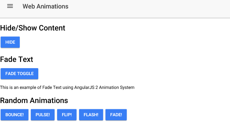
<ion-content>
<h2>Hide/Show Content</h2>
<button ion-button (click)="toggleVisibilityContent()">
{{hideorShow()}}
</button>
<div [@contentVisibility]="contentVisibility">
<h2>Fade Text</h2>
<button ion-button (click)="toggleVisibilityFade()">Fade Toggle</button>
<div [@fadeVisibility]="fadeVisibility" >
<p>This is an example of Fade Text using AngularJS 2 Animation System</p>
</div>
<h2>Random Animations</h2>
<button [@bounce]="bounceState" ion-button (click)="toggleBounce()">Bounce!</button>
<button [@pulse]="pulseState" ion-button (click)="togglePulse()">Pulse!</button>
<button [@flip]="flipState" ion-button (click)="toggleFlip()">Flip!</button>
<button [@flash]="flashState" ion-button (click)="toggleFlash()">Flash!</button>
<button [@fade]="fadeState" ion-button (click)="toggleFade()">Fade!</button>
</div>
</ion-content>Here, we have defined several animations. Firstly, we would show/hide the content once the user has toggled the button. Then, we are using the fade text effect to display the text in an animated manner. Finally, we have defined several buttons for demonstrating different animation effects on them that we will define in our @Component metadata.
When defining buttons, we are using the @states to tell which state belongs to which animation. We will modify the states in our component file.
Now, open the “web.ts” and copy the following:
web.ts
import { Component, trigger, state, style, transition, animate, keyframes } from '@angular/core';
import { NavController } from 'ionic-angular';

@Component({
 selector: 'page-web-api',
 templateUrl: 'web-api.html',
 animations: [
trigger('bounce', [
     state('bouncing', style({
       transform: 'translate3d(0,0,0)'
     })),
     transition('* => bouncing', [
       animate('300ms ease-in', keyframes([
         style({transform: 'translate3d(0,0,0)', offset: 0}),
         style({transform: 'translate3d(0,-10px,0)', offset: 0.5}),
         style({transform: 'translate3d(0,0,0)', offset: 1})
       ]))
     ])
   ]),
trigger('pulse', [
     state('first', style({
       transform: 'scale3d(1, 1, 1)', offset: 0 })),
 state('second', style({
       transform: 'scale3d(1.3, 1.3, 1.3)', offset: 0.5
     })),
 state('third', style({
       transform: 'scale3d(1, 1, 1)', offset: 1
     })),
     transition('first => second', animate('100ms linear')),
 transition('second => third', animate('100ms linear')),
 transition('third => first', animate('100ms linear'))
   ]),
trigger('flip', [
     state('flipped', style({
       transform: 'rotate(180deg)'
     })),
     transition('* => flipped', animate('400ms ease'))
   ]),
trigger('flash', [
     state('first', style({
       opacity: 1, offset: 0 })),
 state('second', style({
        opacity: 0, offset: 0.25
     })),
 state('third', style({
        opacity: 1, offset: 0.5
     })),
 state('fourth', style({
        opacity: 0, offset: 0.75
     })),
 state('fifth', style({
        opacity: 1, offset: 1
     })),
     transition('first => second', animate('100ms linear')),
 transition('second => third', animate('100ms linear')),
 transition('third => fourth', animate('100ms linear')),
 transition('fourth => fifth', animate('100ms linear')),
 transition('fifth => first', animate('100ms linear'))
   ]),

   trigger('fade', [
     state('visible', style({
       opacity: 1
     })),
     state('invisible', style({
       opacity: 0.1
     })),
     transition('visible <=> invisible', animate('200ms linear'))
   ]),


trigger('contentVisibility', [
       state('shown', style({
           opacity: 1
       })),
       state('hidden', style({
           opacity: 0
       })),
       transition('* => *', animate('.5s'))
   ]),
trigger('fadeVisibility', [
     state('true' , style({ opacity: 1, transform: 'scale(1.0)' })),
     state('false', style({ opacity: 0, transform: 'scale(0.0)'  })),
     transition('1 => 0', animate('300ms')),
     transition('0 => 1', animate('900ms'))
   ])

 ]
})
export class WebApiPage {

 showFader : boolean = true;

 // By default, our visibility is set to 'shown'
 contentVisibility = 'shown';

 fadeVisibility = true;

 ionViewDidLoad() {
   console.log('ionViewDidLoad WebApiPage');
 }

 // Our states
 bounceState: String = 'noBounce';
 pulseState: String = 'first';
 flipState: String = 'notFlipped';
 flashState: String = 'first';
 fadeState: String = 'visible';

 constructor(public navCtrl: NavController) {

 }

 hideorShow() {
   return this.contentVisibility == 'shown' ? 'Hide' : 'Show';
 }

 // Our toggle buttons
 toggleVisibilityContent() {
   this.contentVisibility = this.contentVisibility == 'shown' ? 'hidden' : 'shown';
 }

 toggleVisibilityFade() {
   this.fadeVisibility = this.fadeVisibility == true ? false : true;
 }

 toggleBounce(){
   this.bounceState = (this.bounceState == 'noBounce') ? 'bouncing' : 'noBounce';
 }

 togglePulse(){
   this.pulseState = 'first';

   setInterval(() => {
     this.pulseState = 'second';
   }, 500);
setInterval(() => {
     this.pulseState = 'third';
   }, 500);
 }

 toggleFlip(){
   this.flipState = (this.flipState == 'notFlipped') ? 'flipped' : 'notFlipped';
 }

 toggleFlash(){

   this.flashState = 'first';
   setInterval(() => {
     this.flashState = 'second';
   }, 300);
setInterval(() => {
     this.flashState = 'third';
   }, 300);
setInterval(() => {
     this.flashState = 'third';
   }, 300);
setInterval(() => {
     this.flashState = 'fourth';
   }, 300);
setInterval(() => {
     this.flashState = 'fifth';
   }, 300);
 }

 toggleFade() {
   this.fadeState = (this.fadeState == 'visible') ? 'invisible' : 'visible';
 }
}
Here, first we are importing the required modules for the animation. Then in the metadata of @Component, we are defining the animation properties in “animation” array. trigger() is used for defining the animation, and it is taking the name of the animation, state, style and transition() method which further takes the states of the animation.
“300ms”, “100ms”, etc. is the duration of the animation, ease-in, ease, ease-out, linear, etc. is the animation curve, and transform is used for giving the transformation properties (i.e., increase the size, change position, etc.). The remaining code in this metadata should be self-explanatory.
You can use this tool (https://www.npmjs.com/package/keyframes-tool) to convert the normal CSS animations to the Web Animations API format (like I did for “pulse” and “flash” animation).
We are using toggle buttons to change the states, so for example, if the state isn’t flipped already, then clicking on the button makes it “flipped”, on the other hand, if it’s “flipped” already, then it changes to “notFlipped” and so on.
The translate3d method actually uses the GPU (Graphics Processing Unit). In AngularJS 1, ngAnimate was used, but with the advent of AngularJS 2, a better animation system is introduced. Previously, it was purely CSS, but now most of the logic resides in our component side.
Now we can exert a great deal of control over every facet of our animations. We can also define our own triggers and specify as many states as we want.
Make sure the page is included in “app.component.ts” and “app.module.ts”. You can “ionic serve” now to see the results.
You can read more about AngularJS 2’s Animation here: https://angular.io/docs/ts/latest/guide/animations.html
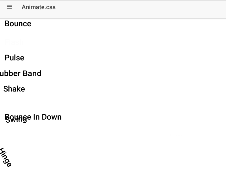
Animate.css
You can use the old native CSS approach for animations, albeit with a modern flavor. Animate.css is a CSS library for cross-browser animations. It has around 50 animations defined in the library, so you just add the animation name to your element and it will work!
In order to install it, do “npm install animate.css –save” to install it locally, then you can add the following line under the <head> tag to get the animation running:
<head>
 <link rel="stylesheet" href="animate.min.css">
</head>
Or if you want to fetch the CSS file from an online source, then you can use the CDN approach:
<head>
 <link rel="stylesheet" href="https://cdnjs.cloudflare.com/ajax/libs/animate.css/3.5.2/animate.min.css">
</head>
See here (https://github.com/daneden/animate.css) for more information. Now, whatever element you want to animate, just add “animate” in the element along with the kind of animation, something like following:
<h1 class="animated infinite bounce">Bounce</h1>Let’s create a new page to demonstrate this library:
$ionic g page animate-cssOpen the “animate-css.html” and copy the following code:
animate-css.html
<ion-header>
 <ion-navbar>
   <button ion-button menuToggle>
     <ion-icon name="menu"></ion-icon>
   </button>
   <ion-title>Animate.css</ion-title>
 </ion-navbar>
</ion-header>

<ion-content padding>

<h1 class="animated infinite bounce">Bounce</h1>
<h1 class="animated infinite flash">Flash</h1>
<h1 class="option animated pulse">Pulse</h1>
<h1 class="animated infinite rubberBand">Rubber Band</h1>
<h1 class="animated infinite shake">Shake</h1>
<h1 class="animated infinite swing">Swing</h1>
<h1 class="animated infinite bounceInDown">Bounce In Down</h1>
<h1 class="animated infinite bounceOut">Bounce Out</h1>
<h1 class="animated infinite hinge">Hinge</h1>

</ion-content>
Here, I have defined several animations which I am applying to the heading elements. Make sure to add the component in “app.component.ts” and “app.module.ts”. You can see I have added the “option” class in one of the element, so open the “animate-css.scss” and copy the following code:
animate-css.scss
page-animate-css {
 .option {
 animation-duration: 5s;
 animation-delay: 2s;
 animation-iteration-count: 2;
 }
}
You can apply as many options as you like for your animations. All you need to use are basic CSS3 animations properties. You can do “ionic serve” now to see the results.
Also, make sure that you are connected to the internet if you used the CDN approach, otherwise the animations won’t work.
Back to Native CSS
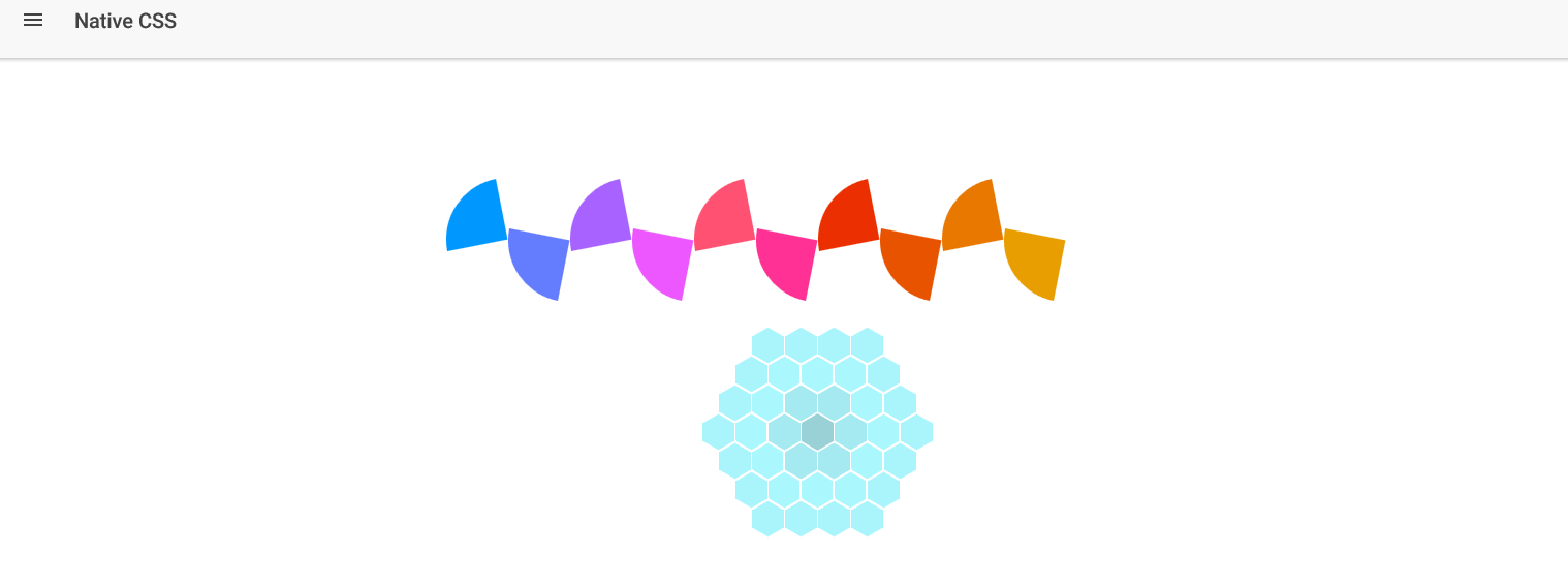
Earlier, I mentioned the native CSS approach. So, let’s add something cool to our application. Create a new page:
$ionic g page native-css
We are going to implement some complex animations using the native approach. There are a lot of websites that provide the template for animations. One such website is (https://dcrazed.com/css3-animation-examples/) which has a lot of beautiful CSS examples. I will use two examples from this site.
Open the “native-css.html” and copy the following code:
native-css.html
<ion-header>
 <ion-navbar>
   <button ion-button menuToggle>
     <ion-icon name="menu"></ion-icon>
   </button>
   <ion-title>Native CSS</ion-title>
 </ion-navbar>
</ion-header>

<ion-content padding>

<div id="loading-animation">
<div class="scene">
<div class="circle a"></div>
<div class="circle b"></div>
<div class="circle c"></div>
<div class="circle d"></div>
<div class="circle e"></div>
<div class="circle f"></div>
<div class="circle g"></div>
<div class="circle h"></div>
<div class="circle i"></div>
<div class="circle j"></div>
</div>
</div>

<div id="honey">
<div class="socket">
<div class="gel center-gel">
<div class="hex-brick h1"></div>
<div class="hex-brick h2"></div>
<div class="hex-brick h3"></div>
</div>
<div class="gel c1 r1">
<div class="hex-brick h1"></div>
<div class="hex-brick h2"></div>
<div class="hex-brick h3"></div>
</div>
<div class="gel c2 r1">
<div class="hex-brick h1"></div>
<div class="hex-brick h2"></div>
<div class="hex-brick h3"></div>
</div>
<div class="gel c3 r1">
<div class="hex-brick h1"></div>
<div class="hex-brick h2"></div>
<div class="hex-brick h3"></div>
</div>
<div class="gel c4 r1">
<div class="hex-brick h1"></div>
<div class="hex-brick h2"></div>
<div class="hex-brick h3"></div>
</div>
<div class="gel c5 r1">
<div class="hex-brick h1"></div>
<div class="hex-brick h2"></div>
<div class="hex-brick h3"></div>
</div>
<div class="gel c6 r1">
<div class="hex-brick h1"></div>
<div class="hex-brick h2"></div>
<div class="hex-brick h3"></div>
</div>
<div class="gel c7 r2">
<div class="hex-brick h1"></div>
<div class="hex-brick h2"></div>
<div class="hex-brick h3"></div>
</div>
<div class="gel c8 r2">
<div class="hex-brick h1"></div>
<div class="hex-brick h2"></div>
<div class="hex-brick h3"></div>
</div>
<div class="gel c9 r2">
<div class="hex-brick h1"></div>
<div class="hex-brick h2"></div>
<div class="hex-brick h3"></div>
</div>
<div class="gel c10 r2">
<div class="hex-brick h1"></div>
<div class="hex-brick h2"></div>
<div class="hex-brick h3"></div>
</div>
<div class="gel c11 r2">
<div class="hex-brick h1"></div>
<div class="hex-brick h2"></div>
<div class="hex-brick h3"></div>
</div>
<div class="gel c12 r2">
<div class="hex-brick h1"></div>
<div class="hex-brick h2"></div>
<div class="hex-brick h3"></div>
</div>
<div class="gel c13 r2">
<div class="hex-brick h1"></div>
<div class="hex-brick h2"></div>
<div class="hex-brick h3"></div>
</div>
<div class="gel c14 r2">
<div class="hex-brick h1"></div>
<div class="hex-brick h2"></div>
<div class="hex-brick h3"></div>
</div>
<div class="gel c15 r2">
<div class="hex-brick h1"></div>
<div class="hex-brick h2"></div>
<div class="hex-brick h3"></div>
</div>
<div class="gel c16 r2">
<div class="hex-brick h1"></div>
<div class="hex-brick h2"></div>
<div class="hex-brick h3"></div>
</div>
<div class="gel c17 r2">
<div class="hex-brick h1"></div>
<div class="hex-brick h2"></div>
<div class="hex-brick h3"></div>
</div>
<div class="gel c18 r2">
<div class="hex-brick h1"></div>
<div class="hex-brick h2"></div>
<div class="hex-brick h3"></div>
</div>
<div class="gel c19 r3">
<div class="hex-brick h1"></div>
<div class="hex-brick h2"></div>
<div class="hex-brick h3"></div>
</div>
<div class="gel c20 r3">
<div class="hex-brick h1"></div>
<div class="hex-brick h2"></div>
<div class="hex-brick h3"></div>
</div>
<div class="gel c21 r3">
<div class="hex-brick h1"></div>
<div class="hex-brick h2"></div>
<div class="hex-brick h3"></div>
</div>
<div class="gel c22 r3">
<div class="hex-brick h1"></div>
<div class="hex-brick h2"></div>
<div class="hex-brick h3"></div>
</div>
<div class="gel c23 r3">
<div class="hex-brick h1"></div>
<div class="hex-brick h2"></div>
<div class="hex-brick h3"></div>
</div>
<div class="gel c24 r3">
<div class="hex-brick h1"></div>
<div class="hex-brick h2"></div>
<div class="hex-brick h3"></div>
</div>
<div class="gel c25 r3">
<div class="hex-brick h1"></div>
<div class="hex-brick h2"></div>
<div class="hex-brick h3"></div>
</div>
<div class="gel c26 r3">
<div class="hex-brick h1"></div>
<div class="hex-brick h2"></div>
<div class="hex-brick h3"></div>
</div>
<div class="gel c28 r3">
<div class="hex-brick h1"></div>
<div class="hex-brick h2"></div>
<div class="hex-brick h3"></div>
</div>
<div class="gel c29 r3">
<div class="hex-brick h1"></div>
<div class="hex-brick h2"></div>
<div class="hex-brick h3"></div>
</div>
<div class="gel c30 r3">
<div class="hex-brick h1"></div>
<div class="hex-brick h2"></div>
<div class="hex-brick h3"></div>
</div>
<div class="gel c31 r3">
<div class="hex-brick h1"></div>
<div class="hex-brick h2"></div>
<div class="hex-brick h3"></div>
</div>
<div class="gel c32 r3">
<div class="hex-brick h1"></div>
<div class="hex-brick h2"></div>
<div class="hex-brick h3"></div>
</div>
<div class="gel c33 r3">
<div class="hex-brick h1"></div>
<div class="hex-brick h2"></div>
<div class="hex-brick h3"></div>
</div>
<div class="gel c34 r3">
<div class="hex-brick h1"></div>
<div class="hex-brick h2"></div>
<div class="hex-brick h3"></div>
</div>
<div class="gel c35 r3">
<div class="hex-brick h1"></div>
<div class="hex-brick h2"></div>
<div class="hex-brick h3"></div>
</div>
<div class="gel c36 r3">
<div class="hex-brick h1"></div>
<div class="hex-brick h2"></div>
<div class="hex-brick h3"></div>
</div>
<div class="gel c37 r3">
<div class="hex-brick h1"></div>
<div class="hex-brick h2"></div>
<div class="hex-brick h3"></div>
</div>
</div>
</div>

</ion-content>
Now, open the “native-css.scss” and copy the following code:
native-css.scss
page-native-css {
	#honey {
		background: #1e1e1e;
	}
	.socket {
		width: 200px;
		height: 200px;
		position: absolute;
		left: 50%;
		margin-left: -100px;
		top: 50%;
		margin-top: -100px;
	}
	.hex-brick {
		background: #ABF8FF;
		width: 30px;
		height: 17px;
		position: absolute;
		top: 5px;
		animation-name: fade;
		animation-duration: 2s;
		animation-iteration-count: infinite;
		-webkit-animation-name: fade;
		-webkit-animation-duration: 2s;
		-webkit-animation-iteration-count: infinite;
	}
	.h2 {
		transform: rotate(60deg);
		-webkit-transform: rotate(60deg);
	}
	.h3 {
		transform: rotate(-60deg);
		-webkit-transform: rotate(-60deg);
	}
	.gel {
		height: 30px;
		width: 30px;
		transition: all .3s;
		-webkit-transition: all .3s;
		position: absolute;
		top: 50%;
		left: 50%;
	}
	.center-gel {
		margin-left: -15px;
		margin-top: -15px;
		animation-name: pulse;
		animation-duration: 2s;
		animation-iteration-count: infinite;
		-webkit-animation-name: pulse;
		-webkit-animation-duration: 2s;
		-webkit-animation-iteration-count: infinite;
	}
	.c1 {
		margin-left: -47px;
		margin-top: -15px;
	}
	.c2 {
		margin-left: -31px;
		margin-top: -43px;
	}
	.c3 {
		margin-left: 1px;
		margin-top: -43px;
	}
	.c4 {
		margin-left: 17px;
		margin-top: -15px;
	}
	.c5 {
		margin-left: -31px;
		margin-top: 13px;
	}
	.c6 {
		margin-left: 1px;
		margin-top: 13px;
	}
	.c7 {
		margin-left: -63px;
		margin-top: -43px;
	}
	.c8 {
		margin-left: 33px;
		margin-top: -43px;
	}
	.c9 {
		margin-left: -15px;
		margin-top: 41px;
	}
	.c10 {
		margin-left: -63px;
		margin-top: 13px;
	}
	.c11 {
		margin-left: 33px;
		margin-top: 13px;
	}
	.c12 {
		margin-left: -15px;
		margin-top: -71px;
	}
	.c13 {
		margin-left: -47px;
		margin-top: -71px;
	}
	.c14 {
		margin-left: 17px;
		margin-top: -71px;
	}
	.c15 {
		margin-left: -47px;
		margin-top: 41px;
	}
	.c16 {
		margin-left: 17px;
		margin-top: 41px;
	}
	.c17 {
		margin-left: -79px;
		margin-top: -15px;
	}
	.c18 {
		margin-left: 49px;
		margin-top: -15px;
	}
	.c19 {
		margin-left: -63px;
		margin-top: -99px;
	}
	.c20 {
		margin-left: 33px;
		margin-top: -99px;
	}
	.c21 {
		margin-left: 1px;
		margin-top: -99px;
	}
	.c22 {
		margin-left: -31px;
		margin-top: -99px;
	}
	.c23 {
		margin-left: -63px;
		margin-top: 69px;
	}
	.c24 {
		margin-left: 33px;
		margin-top: 69px;
	}
	.c25 {
		margin-left: 1px;
		margin-top: 69px;
	}
	.c26 {
		margin-left: -31px;
		margin-top: 69px;
	}
	.c27 {
		margin-left: -79px;
		margin-top: -15px;
	}
	.c28 {
		margin-left: -95px;
		margin-top: -43px;
	}
	.c29 {
		margin-left: -95px;
		margin-top: 13px;
	}
	.c30 {
		margin-left: 49px;
		margin-top: 41px;
	}
	.c31 {
		margin-left: -79px;
		margin-top: -71px;
	}
	.c32 {
		margin-left: -111px;
		margin-top: -15px;
	}
	.c33 {
		margin-left: 65px;
		margin-top: -43px;
	}
	.c34 {
		margin-left: 65px;
		margin-top: 13px;
	}
	.c35 {
		margin-left: -79px;
		margin-top: 41px;
	}
	.c36 {
		margin-left: 49px;
		margin-top: -71px;
	}
	.c37 {
		margin-left: 81px;
		margin-top: -15px;
	}
	.r1 {
		animation-name: pulse;
		animation-duration: 2s;
		animation-iteration-count: infinite;
		animation-delay: .2s;
		-webkit-animation-name: pulse;
		-webkit-animation-duration: 2s;
		-webkit-animation-iteration-count: infinite;
		-webkit-animation-delay: .2s;
	}
	.r2 {
		animation-name: pulse;
		animation-duration: 2s;
		animation-iteration-count: infinite;
		animation-delay: .4s;
		-webkit-animation-name: pulse;
		-webkit-animation-duration: 2s;
		-webkit-animation-iteration-count: infinite;
		-webkit-animation-delay: .4s;
	}
	.r3 {
		animation-name: pulse;
		animation-duration: 2s;
		animation-iteration-count: infinite;
		animation-delay: .6s;
		-webkit-animation-name: pulse;
		-webkit-animation-duration: 2s;
		-webkit-animation-iteration-count: infinite;
		-webkit-animation-delay: .6s;
	}
	.r1>.hex-brick {
		animation-name: fade;
		animation-duration: 2s;
		animation-iteration-count: infinite;
		animation-delay: .2s;
		-webkit-animation-name: fade;
		-webkit-animation-duration: 2s;
		-webkit-animation-iteration-count: infinite;
		-webkit-animation-delay: .2s;
	}
	.r2>.hex-brick {
		animation-name: fade;
		animation-duration: 2s;
		animation-iteration-count: infinite;
		animation-delay: .4s;
		-webkit-animation-name: fade;
		-webkit-animation-duration: 2s;
		-webkit-animation-iteration-count: infinite;
		-webkit-animation-delay: .4s;
	}
	.r3>.hex-brick {
		animation-name: fade;
		animation-duration: 2s;
		animation-iteration-count: infinite;
		animation-delay: .6s;
		-webkit-animation-name: fade;
		-webkit-animation-duration: 2s;
		-webkit-animation-iteration-count: infinite;
		-webkit-animation-delay: .6s;
	}
	@keyframes pulse {
		0% {
			-webkit-transform: scale(1);
			transform: scale(1);
		}
		50% {
			-webkit-transform: scale(0.01);
			transform: scale(0.01);
		}
		100% {
			-webkit-transform: scale(1);
			transform: scale(1);
		}
	}
	@keyframes fade {
		0% {
			background: #ABF8FF;
		}
		50% {
			background: #90BBBF;
		}
		100% {
			background: #ABF8FF;
		}
	}
	@-webkit-keyframes pulse {
		0% {
			-webkit-transform: scale(1);
			transform: scale(1);
		}
		50% {
			-webkit-transform: scale(0.01);
			transform: scale(0.01);
		}
		100% {
			-webkit-transform: scale(1);
			transform: scale(1);
		}
	}
	@-webkit-keyframes fade {
		0% {
			background: #ABF8FF;
		}
		50% {
			background: #389CA6;
		}
		100% {
			background: #ABF8FF;
		}
	}
	#loading-animation {}
	.scene {
		width: 600px;
		height: 60px;
		margin: 100px auto;
	}
	.circle {
		width: 60px;
		height: 60px;
		border-top-right-radius: 60px;
		float: left;
		transform-origin: bottom left;
	}
	.a, .c, .e, .g, .i {
		animation: rotate1 1s ease-in-out alternate infinite;
	}
	.b, .d, .f, .h, .j {
		animation: rotate2 1s ease-in-out alternate infinite;
		transform: rotate(90deg);
	}
	.a {
		background: rgb(0, 152, 255);
	}
	.b {
		background: rgb(100, 125, 255);
	}
	.c {
		background: rgb(167, 98, 255);
	}
	.d {
		background: rgb(237, 87, 255);
	}
	.e {
		background: rgb(255, 81, 113);
	}
	.f {
		background: rgb(255, 49, 148);
	}
	.g {
		background: rgb(235, 47, 0);
	}
	.h {
		background: rgb(232, 83, 0);
	}
	.i {
		background: rgb(232, 120, 0);
	}
	.j {
		background: rgb(232, 158, 0);
	}
	@keyframes rotate1 {
		100% {
			transform: rotate(-360deg);
		}
	}
	@keyframes rotate2 {
		100% {
			transform: rotate(450deg);
		}
	}
}
Make sure the component is added in “app.component.ts” and “app.module.ts”. Here, I have used the two loading screen examples from the site. You can use as many examples as you want. There is an abundence of material online, so there’s no need to cover everything here.
You can do “ionic serve” now to see the results.
So, which approach is best? Well, for the Ionic 2, there is no doubt AngularJS 2’s animation is best so far, because it provides a modular solution, and you can easily convert CSS animations to the Web Animations API format. But, if you want to showcase the animations in your application, then it’s better to stick with the native CSS3 approach, as you can copy/paste a plethora of examples from the internet.
If you have trouble following the code, then I have uploaded the repository here (https://github.com/danyalzia/ionic2-animation-play).
Summary
So, let’s see what we have learned so far:
- How animations work in web development
- The advent of CSS3 Animations and Transitions
- Web Animations API approach to animations
- AngularJS 2’s implementation of Web Animations API
- Native CSS vs Web Animations API approach
Conclusion
You can see the different approaches to tackling animations in Ionic 2. There is no doubt that implementing animations in Ionic 2 is a very easy job as long as you understand the supported tools and have the passion for designing the sophisticated keyframes for enhancing user experience.
If you have any question, then you can ask in the comment section below! And be sure to stop by the homepage to search and compare the best SDKs, APIs, and other development tools.
Recent Stories


Top DiscoverSDK Experts


Featured Products
)

)
)
Compare Products
Select up to three two products to compare by clicking on the compare icon () of each product.
{{compareToolModel.Error}}
{{CommentsModel.TotalCount}} Comments
Your Comment